How I designed my SaaS landing page with AI tools

Hey, what's up? It's Takuya here. Recently, I rebuilt the landing page for Inkdrop, which has a demo app built with the real components. It self-plays an editing session when you visit, and at the same time, you can actually edit notes in it.
I just posted a new video on YouTube where I share how to build an interactive self-typing editor demo with Waku + CodeMirror.
The video walks through the steps in the way of traditional manual coding.
But I used Claude Code to build it in my real workflow.
In this article, I'd like to share how I experimented with designing using AI tools, which websites I referred to, and what prompts I used. The video focused on the technical part of the editor demo, while this article focuses on the design part.
Using AI design tools to experiment with ideas quickly
The end result is not what I directly created in one iteration.
Of course, I explored a lot of other ideas and possibilities.
Here is what I did.
Gathering ideas
I've been thinking of building a new website since last year.
I've been taking notes for inspiration like this:
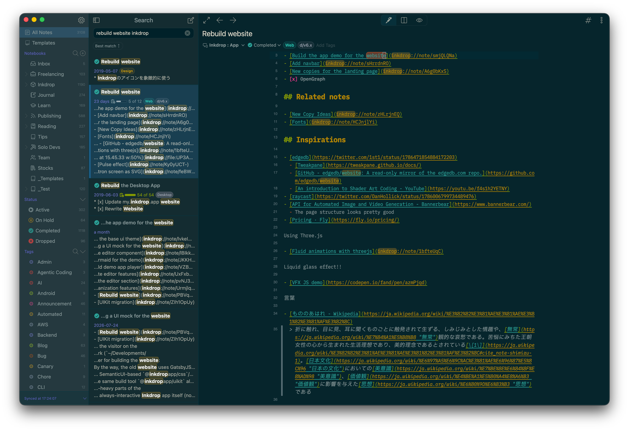
As you can see in the note, I've been considering using Three.js to create an interesting effect to make the page attractive.
And I'm a huge fan of Oğuz's works. So, I really wanted to replicate his design style.
Trying new AI-native design tools
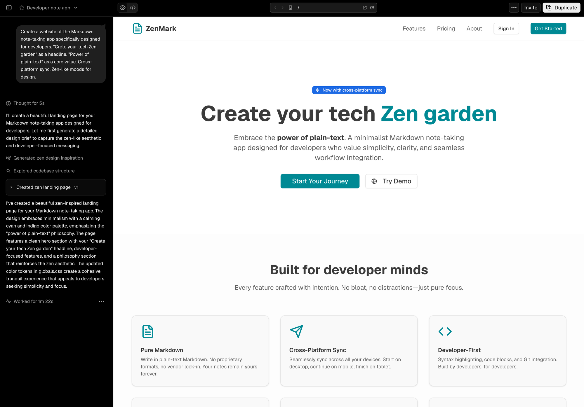
Last year, I used Vercel's v0 to design a TOTP form, and it worked great.
So, I tried v0 again. I iterated on a few prompts, but the results looked mediocre and boring.
After that, I tried GPT Images 2.0 and it blew my mind. The output image looked so nice:
I don’t usually overreact to AI hype, but GPT Images 2.0 is actually insane. I got this landing page sketch for Inkdrop from a one-shot prompt that included summaries of my app concept, the new features in v6, and my recent blog posts about Japanese culture. I never imagined web… pic.twitter.com/V7HJwIwU0e
— Takuya 🐾 devaslife (@inkdrop_app) April 22, 2026
So, I fed the image into Claude Design to implement it:
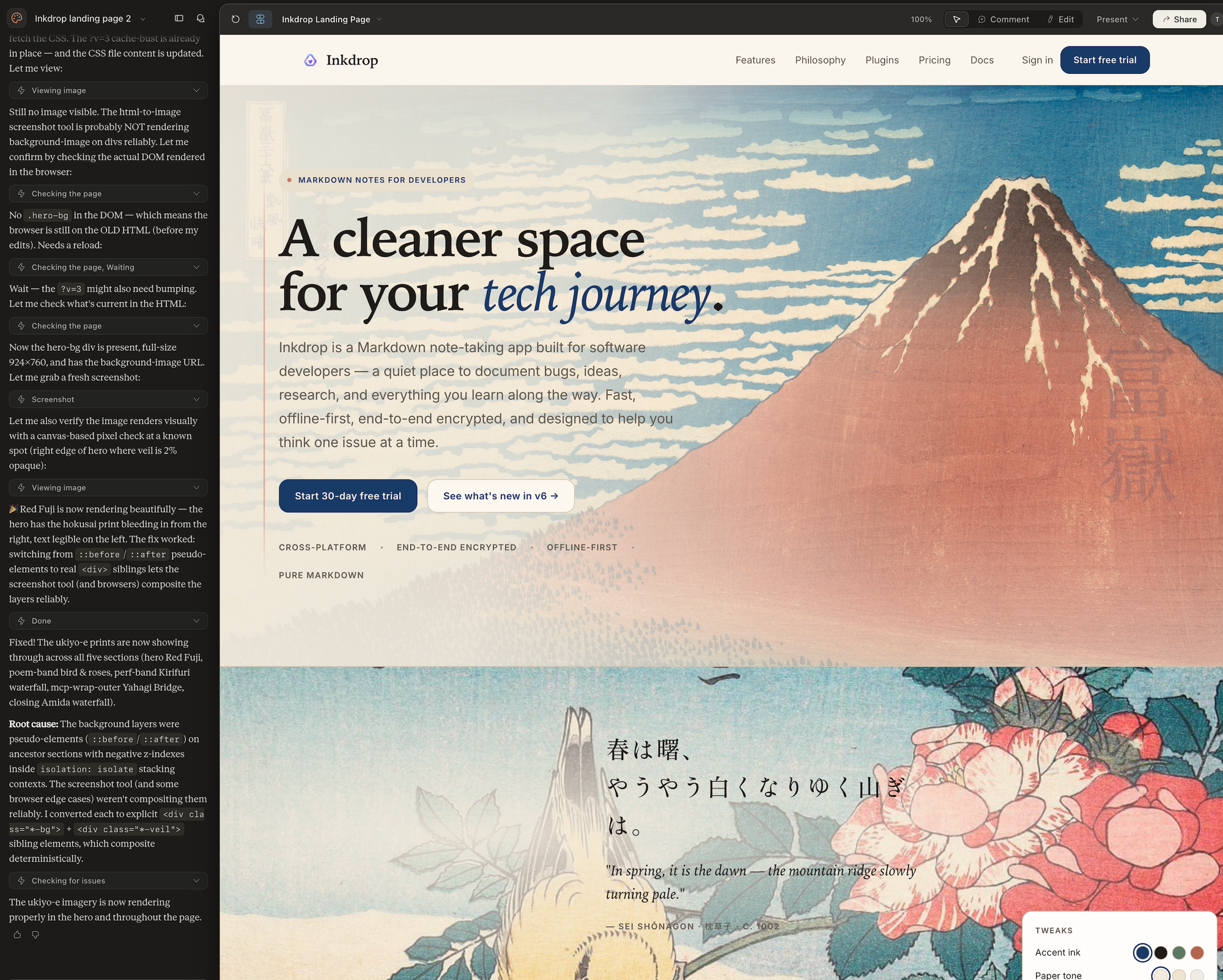
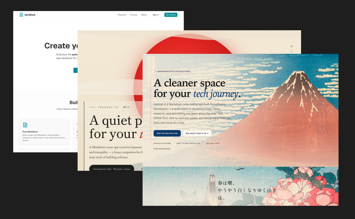
The layout was somewhat broken, but it got a little bit better than v0.
However, the Japanese prose ("春は曙、やうやう白くなりゆく山ぎは。") doesn't make any sense on a product website.
Here is another iteration:
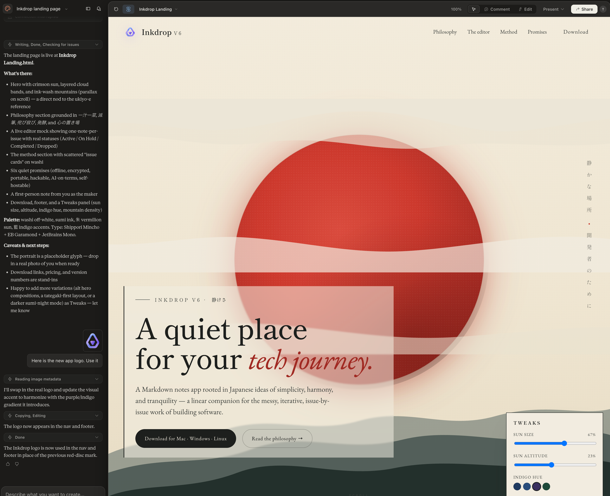
lol, this one was too Japanese-ish. Who'd expect to see a red sun on a SaaS landing page?
Also, I've noticed recently, when visiting other websites, that Claude has a tendency to generate a similar look and vibe. So, I disliked these taste slops.
I also tried VoltAgent/awesome-design-md, but it just generated an average design. Maybe useful for creating websites that don't have to be unique. It wasn't for this project. I was planning to use Ship Studio, but didn't use it this time.
These experiments weren't waste of time. It let me quickly try various ideas and find a right direction. And it was fun to try new AI-native design tools. I think they should work way better than when I tried.
I realized I prefer a simple design
While checking out Oğuz's work like this and this, I found that they are absolutely cool, but there is a critical issue in these designs.
That is, I couldn't understand what the product does and how it works because my attention was caught by these amazing UI mocks and animations. I simply couldn't focus on the content. Also, it seemed hard to maintain as a solo developer.
On the other hand, I liked simple websites like Sketch, fly.io, and Stripe.
So, I decided to go with this simple design direction.
Building a real UI demo
What I don't like about screenshots and videos is that I can't actually try the product.
Of course, it's technically impossible if your product is a native app like Sketch.
But mine is an Electron-based app, whose UI is compatible with browsers.
Since I really wanted to replicate Oğuz's style, I tried to mix these ideas:
- A demo with real UI components that showcases the look and feel
- A real editor component that lets you actually try it right on the webpage
This way, I can achieve an attractive design while providing a demo so visitors can quickly understand how it works.
Extracting UI components from the desktop app
I refactored the desktop app source to extract its React components into a separate library called uikit.
It uses Storybook to check the component designs.
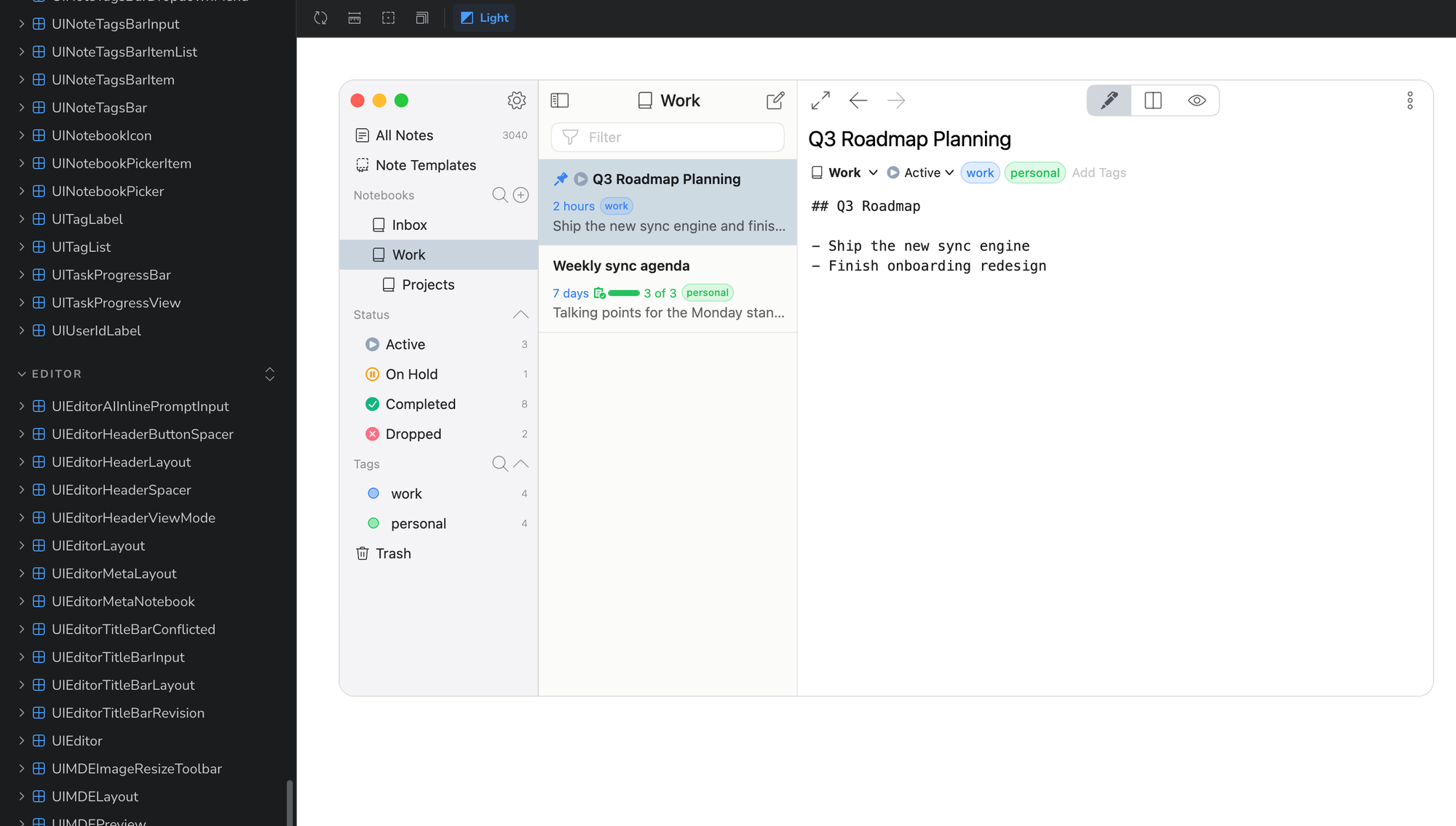
So, I can easily update the website whenever I change the app's UI.
I followed Radix UI's design pattern.
This wouldn't have been possible without the help of AI agents, because it required lots of work!
Here is the idea note that I had AI read. It explains the idea briefly:
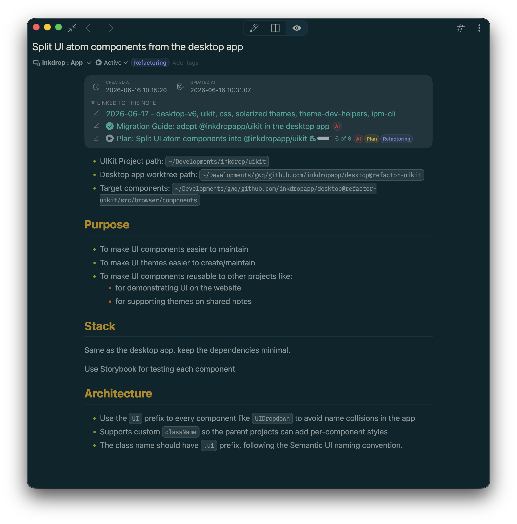
Then, I asked AI to create plan notes with implementation phases in detail. This one ended up being a super long note:
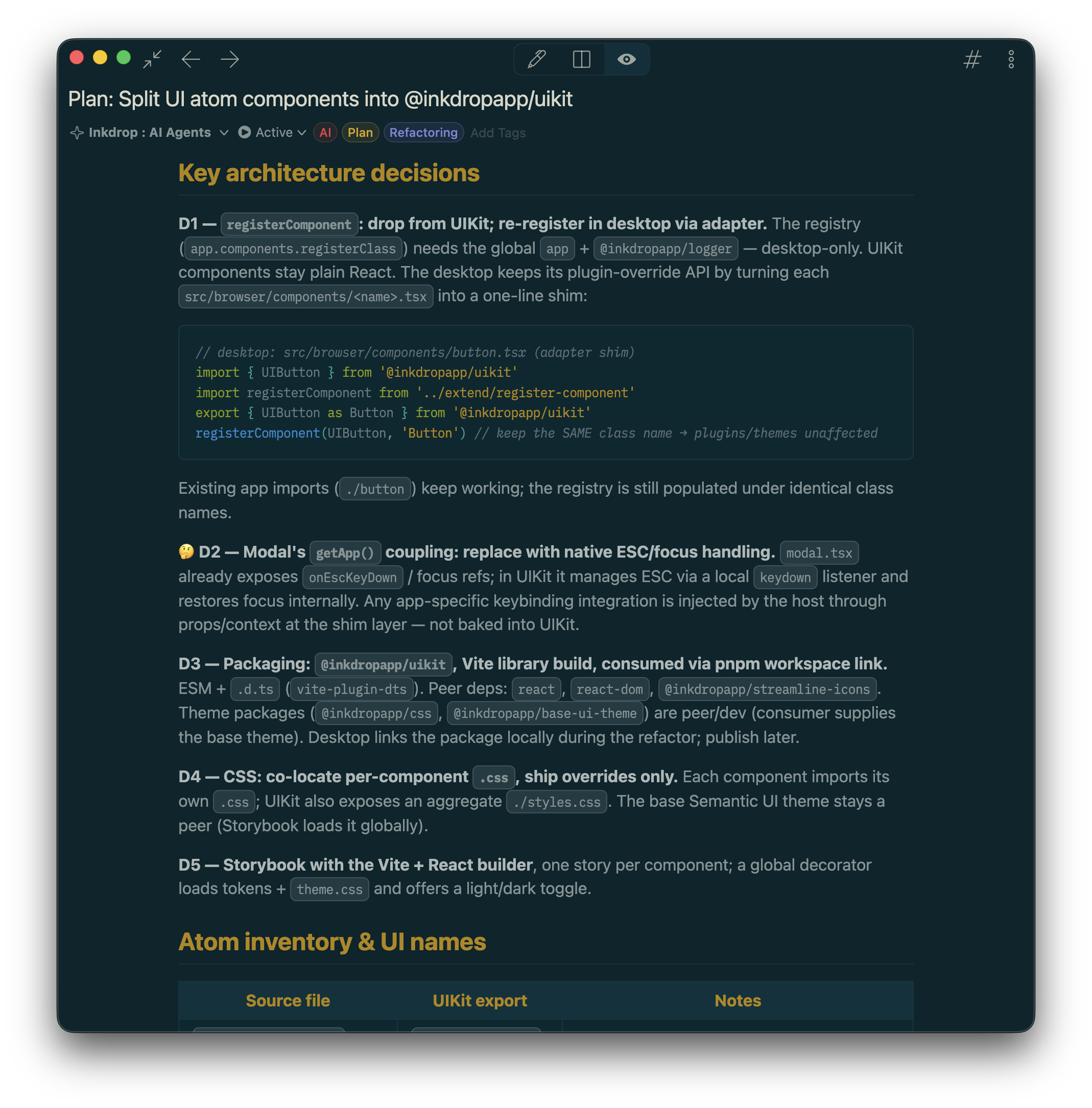
I refactored and reviewed the components one by one, not in a single shot. Claude Code often made mistakes and broke the component behaviors.
Creating consistent branding
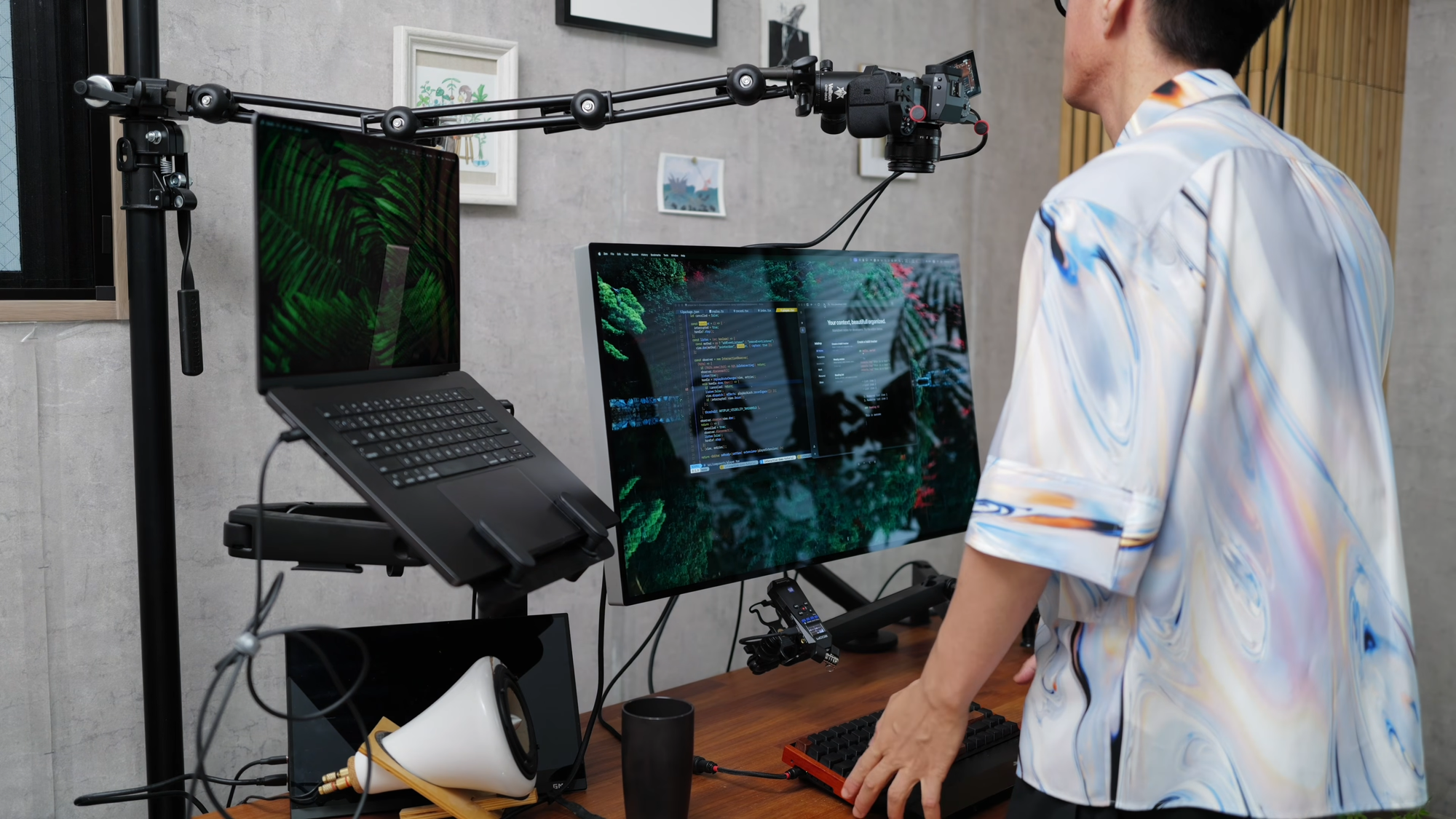
You may know I've been publishing videos on YouTube (devaslife & craftzdog).
I wanted to let visitors from my channels know it's my product, without showing my face or mentioning the channel names.
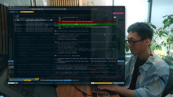
So, I decided to record footage of myself composing a tech note and put it behind the app demo.
It resulted in achieving two "wow"s:
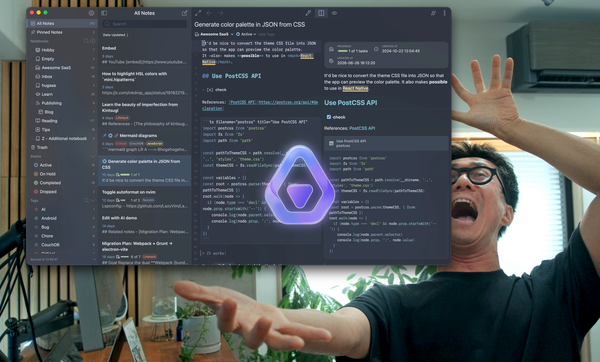
- Wow, the editor syncs with the background footage!
- Wow, and I can actually try the app here!
I think these wows genuinely contribute to understanding the product rather than distracting from it.
Prompting tips and examples
1. Plan in a note, execute by phase
As you can see above, my basic workflow is to have AI write a plan first.
Inkdrop supports note templates, and you can pick the "Implementation plan" template to replicate the process.
So, I prompted like:
fill out <NOTE LINK>
then, Claude Code filled out the template via the MCP server. After reviewing the plan, said:
work on phase 1
then, commit it, and:
work on phase 2
Claude Code regularly updated the plan note as it discovered unexpected issues and new decisions.
2. Point at working code, not at descriptions
I didn't paste code into the chat input. Instead, I constantly pointed at the desktop app's source, Storybook stories, and docs:
currently, the demo app doesn't support workspace view. Implement it by referring to the realistic story of …/sidebar-layout.stories.tsx
it still works strangely. check out …/note-list-bar-item.tsx. You don't have to care about animationEnabled flag here. learn how the app implements note list bar animationslearn about The inline AI assistant here: …/reference/inline-ai-assistant/page.md
check out the UI https://docs.inkdrop.app/images/inline-ai-assistant_popover.png
3. Report bugs like a QA report: device, symptom, hypothesis
When I found a bug where the demo frame was broken on smaller screens, I reported it with three things: where it happens, what I observed, and my guess. For example:
when I view it on my iphone, it rotates 180degrees. I suspect the scale is negative?
backdrop-filter: blur not working on Android device. Do you know why?
I found a bug where when I pressed backspace to remove a char in the editor, the page unexpectedly scrolls, presumably because of scrollIntoView in the editor change handler4. Read source code and point out strange parts
I still read source code in agentic coding, and I often find weird code structures. So, I ask questions like:
do you still need max-width: none?why do you need another backdrop-filter in .demo-app-frame-container-scaled::before?
by the way, these .landing-editor-scene[data-active-step=*] selectors look redundant. are they still necessary?
When Claude Code added a dirty duplicate function or workaround, I said:
addingdemo-app-wrapper-scaledtomasthead-demolooks terrible as it violates separation of concerns. I added .demo-app-frame-container. Refactor the style
5. Trust your instinct and don't let AI generate the whole thing at once
When starting something new, I deliberately under-specified and asked for a static skeleton first:
next is the note organization section. Add a demo frame that only renders the sidebar and note list bar. You don't have to implement scenes or steps yet. I'd like to get inspiration by seeing a static demo frame.
This step lets me visually check what should come next and come up with new ideas.
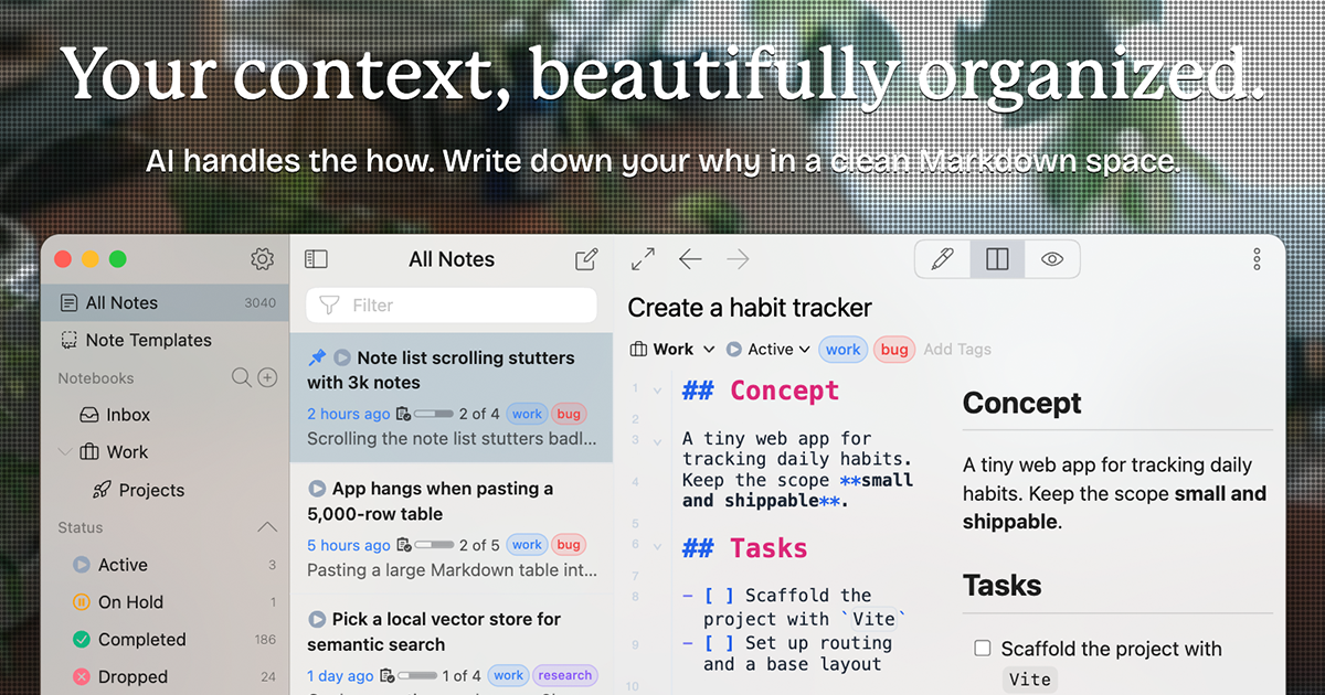
Here is the end result:

That's it! I hope it's helpful for designing your product page with AI.